You know where you are with a product from Bayerische Motoren Werke AG (Bavarian Motor Works aka BMW.) At least you used to.
It was a sporty high-powered saloon, beloved of boy racers who didn’t want to make it too obvious. But they loved their ‘beamers.’ Times have moved on, of course, and the car industry (BMW is now a volume manufacturer) is facing a crisis: the world supposedly wants to move to electric cars but they cost billions, which is a problem for even the mighty BMW. Some of its current range is looking a little tired, presumably because the investment’s going elsewhere.
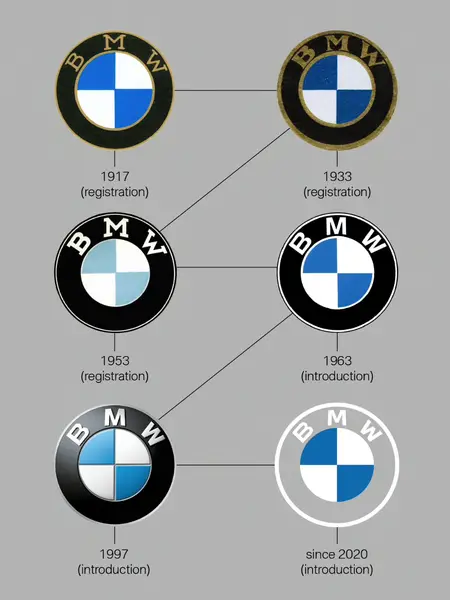
In such circumstances you change the logo of course (badge in this instance.) BMW is introducing a new one, initially for social media communications although it also appears on its new i4 concept electric car.
 Media Post
BMW’s senior VP customer and brand Jens Thiemer says: “We want to use this new transparent version to invite our customers, more than ever, to become part of the world of BMW. In addition, our new brand design is geared to the challenges and opportunities of digitalization for brands. With visual restraint and graphic flexibility, we are equipping ourselves for the vast variety of touchpoints in communication at which BMW will be present, online and offline, in the future.”
BMW says replacing the black ring lets “the new logo radiate more openness and clarity.”
It’s an interesting notion – and an interesting development from the days of the “ultimate driving machine.”
But isn’t that what you still want?