Giles Keeble: in the digital age can a poster be a Modern Classic? Yes – look at (invisible) Mercedes
 Steve Martin once said that humour is complete understanding in a nano second and I always thought that was the test of a good poster, or at least of what the US calls a billboard. There are, of course, different kinds of posters and how they work can depend on size, position and context. I’m always dismayed when I see a charity poster, which an agency has convinced the client will do wonders, stuck under a railway bridge.
The placement of posters and their visibility and legibility reminds me of the story in Jerry della Femina’s book ‘From those wonderful folks who gave you Pearl Harbour’ about a subway poster being presented to a client. They may have cross-track posters in NYC but this was to appear on the platform. The client said that from where he was he wasn’t able to read it : the copywriter replied “If you were standing there you’ll be hit by the fucking train.”
Good point. I am also reminded of the time when I was at Leo Burnett and we were given the wonderful task of doing a poster campaign for posters. The result was a campaign of messages such as ‘OTS’ and ‘Make the logo bigger’ in bold, upper case type. I am embarrassed to admit that I was persuaded by the entire account team not to make the logo and end line (‘Use posters’) too big, with the result that lots of people saw the posters but didn’t know what they were for.
All this is by way of background for an attempt to identify a poster that is a ‘Modern Classic’ . There are a couple of other points to make about this quest. One is that whereas posters and press ads were once quite distinct, they now often appear in the same awards categories. (I am not going get into the debate about whether or not anyone reads long copy any more.)
The second point is the growth of ‘ambient’, or the way in which posters or outdoor use more than one means of communicating. The latter is to be encouraged and surely is more ‘modern’. In my search (partly courtesy of the invaluable Gunn Report website) I have found more creativity in outdoor advertising that is not in a sense one dimensional, and in some instances, is interactive. I do have a concern though about ‘opportunities to see’ and effectiveness.
Some of these ‘modern’ outdoor ads must be hard and expensive to replicate, so unless they are so involving and different that they get photographed and passed on, they may be one-offs. I once did a poster with Neil Dawson for an early Westminster Council initiative for recycling that only ever appeared on one site by London’s Tottenham Court tube on which the ‘re’ was made of old cans and rubbish and the ‘cycle/ was an old cycle.
 The father (or mother) of such posters was the Araldite 48 sheet on the Cromwell Road with the car stuck to it and the headline ‘We also stick handles to teapots.’ Has it been bettered?
So – bearing in mind that the definition of ‘modern’ for this column is of now or the recent past, what are the candidates? The criteria must still include not only the Steve Martin one but also the type of poster, it’s positioning and the context.
 For me there are three ‘classic classics’: the poster for Virgin Airways for flights from Aus to USA (below), the Sunday Times ‘rich list’ ads (left) and the Coca Cola hands poster (below).
The first is a nano second, the second a new and public form of graph and the third such a simple and beautiful distillation of Coke. My only concern about the latter is how and where it was shown, so that all the elements – the hands and the bottle as well as the Coke colours- are seeable.
 An example that straddles classic and modern classic (partly because I think it is a few years old) is the McDonald’s sundial poster (left)- a new kind of poster using an ancient form of time-telling. The best event -coming off a sign (poster?) saying ‘push button for action’ – goes to TNT TV because it was announcing a new station and therefore had a clear objective rather than just being a stunt. A consistently good use of posters now and in the past has to be Harvey Nichols in the UK for their sales ads from DDB.
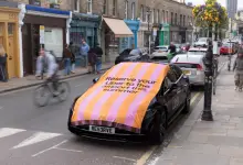
But in the end, my ‘Modern Classic’ is Mercedes ‘Invisible Car’ (from Jung von Matt/Elbe) partly because by being a moving message it answers my concern about replication.


