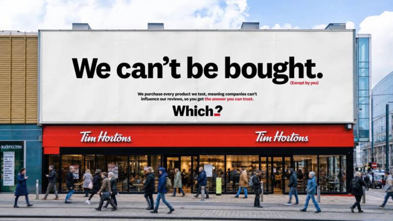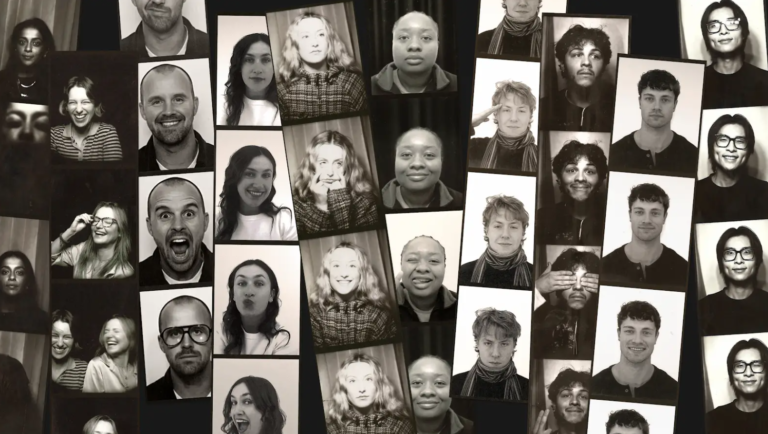
A new corporate identity is an ad of sorts – or should be – and BBH has gone to town in every imaginable way with its new effort, even concocting typefaces to embody the three eponymous founders.
But, on top of being a pretty good advertising agency and a great place to work (for most) what BBH epitomised was ‘cool,’ in a way that no ad agency has really managed since, whatever their other merits.
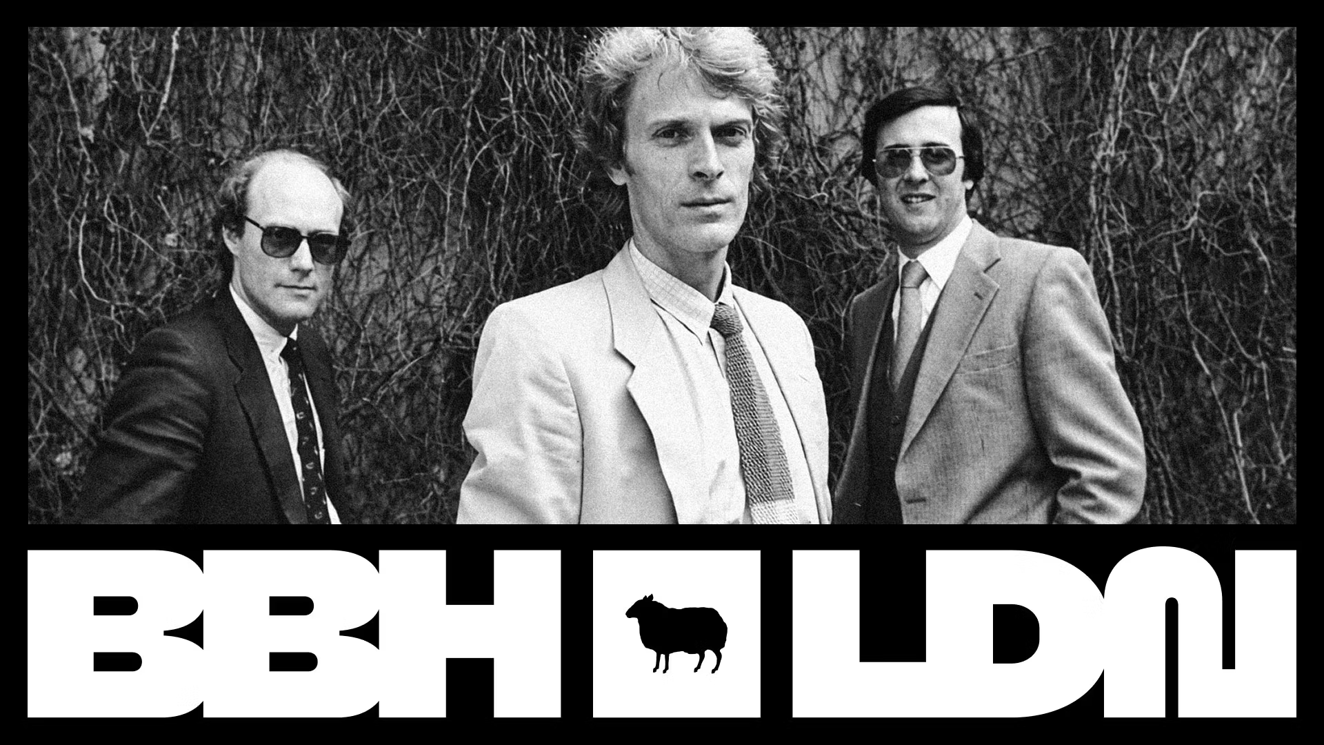
And, as you’d expect, there was some artifice involved. Here, with some of that new type are B,B and H (John Bartle and Nigel Bogle looking like Mafia refugees, or possibly regulars at Cecconi’s) and John Hegarty (centre) well, cool.
There’s lots more too (here.)
But it’s the all-time top trio image that seems to say it all.