When a brand lands in a new market, nobody is sitting waiting for it. There’s no reputation or memory of the last campaign. You get one first impression, there can be a temptation to do a modest test and wait and see.
Alongside the Perk team, we took the opposite view when launching Perk to the USA market. A new entrant has to behave like an established one. Arriving with the confidence of a brand that has already got it figured out is half the job. The other half is making sure people can see you do it.
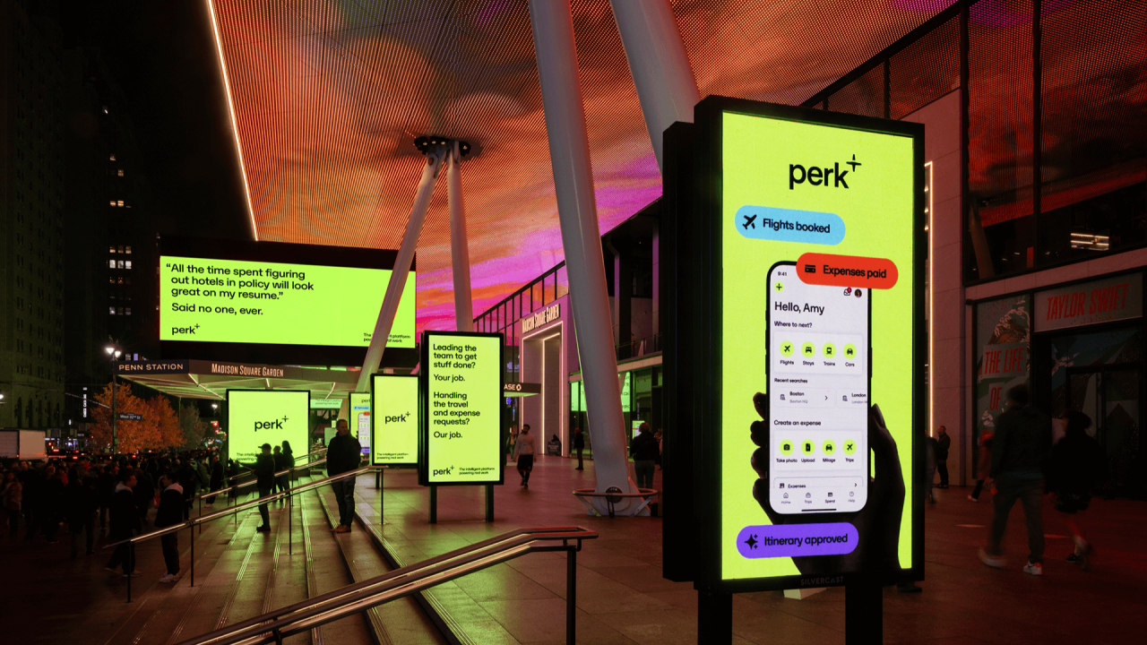
New York made the choice easy. It’s the capital of the business trip, full of people who are in town for work or who leave it regularly for the same reason. Perk provides travel and spend automation to exactly those people, so we went to the places they already move through. Places like Times Square, the NYSE, iconic NY cabs, street kiosks and Moynihan station. Being there does a job no amount of explaining can. A brand that shows up in the bright lights of the city looks like it belongs and trust follows.
The catch is that New York is already full. It’s covered in advertising, so simply being there won’t make a dent. But a takeover isn’t a pile of equally important ads. What’s key is hierarchy.
A small number of hero sites carry the big flex. Those earn the photo, the PR moment and the internal morale boost (in this case they also earned a LinkedIn post from Perk’s founder, commending the work and the craft). Around them sits a layer of frequency: the taxis, street sites and station positions that work harder and people’s daily routes, repeating the message until it sticks. The heroes get you talked about and the workhorses get you remembered. Neither can do the other’s job.
A hero site also has to justify its size, so for the biggest Times Square positions we wanted to make the biggest splash. We modelled every ticket, receipt and asset from scratch, and the billboards themselves were mapped and modelled to give as much depth as each site would allow. The hardest part wasn’t making it look good. It was making it look good in person. A render on a monitor can be forgiving, but an entire building definitely isn’t. Designing for a screen and designing for the side of a building are different crafts, and to go big, the in-person experience was the one that mattered.
The idea underneath was a simple one. Business travel leaves a paper trail nobody wants to deal with, so we leant on a key visual everyone in the target market viscerally feels – an overwhelming pile of expense receipts.
There’s something satisfying in the fact that this was built for real. In a time when a lot of imagery is conjured by a prompt, a campaign that was modelled, crafted and installed on actual buildings gives a brand something to point at.
None of it happens without the right partners. Craft, the media agency, secured and shaped the sites, and we couldn’t have made the work without our partnership with the Perk team, and especially their in-house creative team, who led the charge and established the core of the campaign.
If we had to boil it down for anyone launching somewhere new, it would be to ask the question – how do we make the biggest splash while explaining exactly who you are and what you do.
Get that right and you don’t have to fight for attention. You’ve already got it.
https://www.kit.studio/
https://www.perk.com/