The logo’s not big enough used to be the client lament (these days it’s changed to there aren’t enough products in it ‘cos we’ve only got one TV/Super Bowl ad this year.)
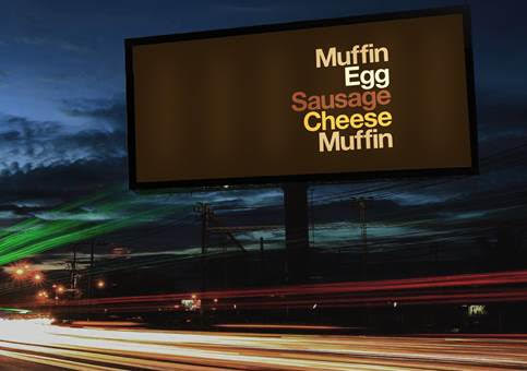
But McDonald’s is hardly likely to be overlooked and Leo Burnett London has made its typography the hero of a new Out of Home campaign.
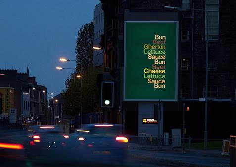
McDonald’s these days seems to do most things, marketing-wise, right. If only they could get rid of that awful furniture. But ‘distressed’ over thousands of outlets is probably a bridge too far.
MAA creative scale: 7.