Santander has commissioned a new logo or “brand” as they say these days, somewhat inexactly, from Omnicom’s Interbrand.
Much of the Spanish bank’s business is online these days and executive chairman Ana Botín says: “The Santander brand is one of our Bank’s major strengths and is recognised internationally for the trust and credibility it conveys. We have to change and innovate. The brand must evolve too, to accompany our transformation, to be more visible and to convey our culture better.
“For the first time in the history of the group, there will be a single brand in all our markets. This new brand is more modern and its visibility improves 20 per cent in digital formats.”
Old and new.
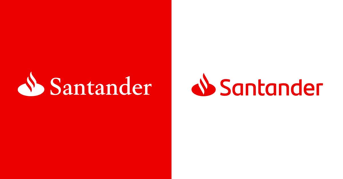
Looks OK. Some sleuth will doubtless discover that it’s going to cost hundreds of millions what with legals (what legals could there be? Don’t worry the lawyers will find some) and repainting all those (offline) branches.
Will it lose some high street impact? But that’s not the game these days, it seems.
Quite how it expresses Santander’s culture better only Ana and her advisers know. More modern, one supposes.
MAA creative scale: 6.